Content blocks reference
Every content block available in Tile Studio: pre-formatted elements for speed, base elements for control.
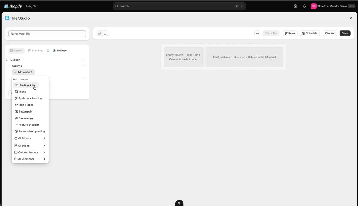
When you hit Add content inside a Column, the block menu opens. It is organized to be fast for common cases without hiding the low-level pieces.
Pre-formatted blocks
The quick picks at the top are pre-formatted combinations, ready to drop in: headings with eyebrows, button pairs, icon plus label pairs, images, and friends. Click All blocks to browse every pre-formatted element in one view. These cover most of what a typical tile needs, already styled sensibly.
Base elements
Below them live the base elements. These are the raw pieces the pre-formatted blocks are made of. Reach for them when you want to compose something exact, one element at a time, with full control over each setting.
Images
Click the picture icon on an Image's Src field and Shopify's own image picker opens inside Tile Studio. Search your store's files, upload a new one, drag one in, or generate one, then click Done. Until you pick an image, the preview shows a StoCu placeholder photo; the placeholder never reaches your live page.
Centering text
To center the words in a Section or Group, set its Align items to center, the first control under Alignment. Paragraphs inside follow it, and they stay centered when they run onto a second line. A Paragraph also has its own Text alignment buttons if you want it to differ.
One limit comes from Shopify: a Heading centers only while it fits on one line. For a longer centered title, use a Paragraph.
Every block you add appears in the layout tree, follows its parent Section and Column, and carries its own settings panel on the left. For how blocks fit into the layout system, see Sections, Columns, and Groups. For shoppable blocks specifically, see Product cards and grids.