Mobile and desktop layouts
Preview both widths and override any setting per device, like hiding a large image on mobile.
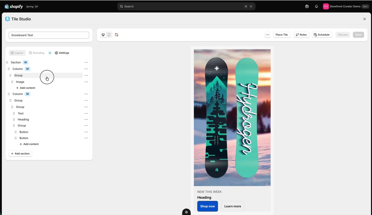
A tile that looks great on desktop can crowd a phone screen. Tile Studio lets you tune each width independently, without maintaining two tiles.
Per-device overrides
Click the mobile icon at the top of the editor to preview the mobile width. Wherever you see an M badge, a mobile-specific setting is already applied. To override a setting just for mobile, select the element and change it while in mobile view.
The classic example: a tall image that eats the whole phone screen. Select the Group that holds the image, open Advanced, and set Display to none. The setting was inherited from desktop; now it is overridden for mobile only, and the Group shows an M badge to remind you.
Why the Group and not the image? The display toggle lives on Sections, Columns, and Groups, not on the image element itself. Keeping media inside a Group is what makes it hideable per device. More in Sections, Columns, and Groups.
Verify on the live store
Save, refresh your live page, and switch widths: the image hides on mobile and shows on desktop. Small overrides like this are what make tiles feel native on every screen your customers use.